Jan
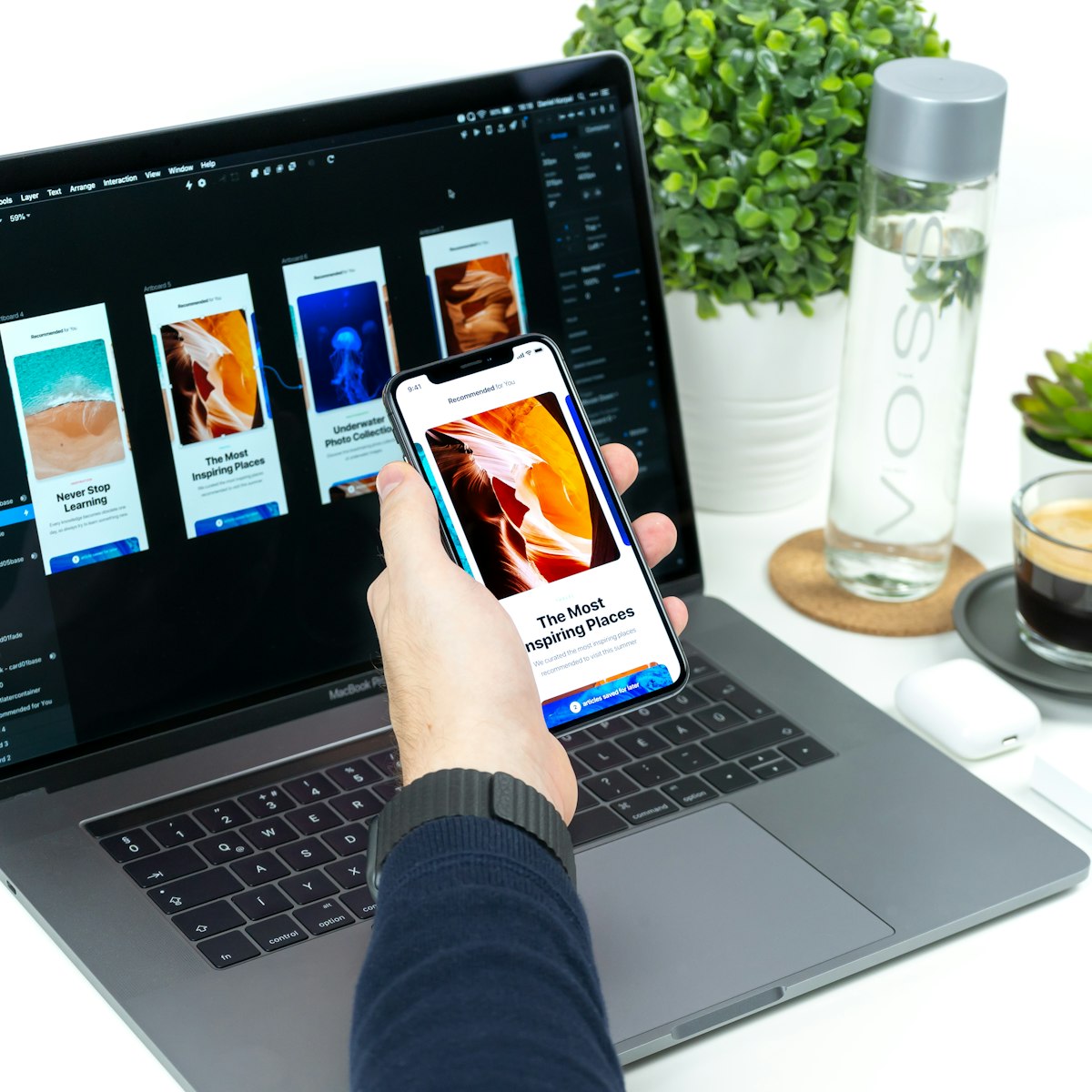
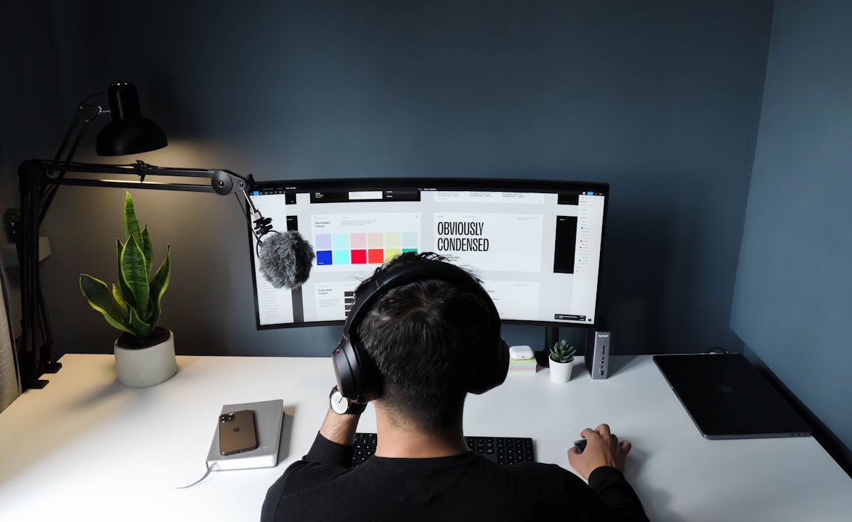
A marketing site has one job that a brand film does not: help someone decide. Colour, motion, and photography should serve that decision, not distract from it. We still love a vivid gradient. We just refuse to hide the offer inside it.
Hierarchy is a promise
Visitors should be able to answer three questions in seconds: what is this, who is it for, and what happens next. Everything else — proof, process, personality — can unfold. We sketch those three answers in type before we touch a layout tool.
Components with a pulse
Buttons, cards, and quotes get the same art direction as the hero. If the hero is warm and the form is cold, conversion drops for reasons analytics will never name. We design a small component library with the identity so developers are not forced to invent grey boxes.
Performance is part of the craft. Natural photography is compressed with care. Motion is used to explain, not to decorate loading. A colourful site can still feel fast.
Back to blog