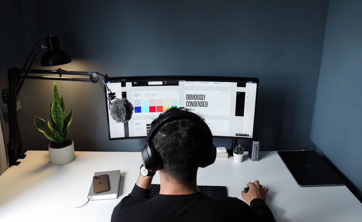
Feb
A palette pulled from a moodboard will look charming in a presentation and collapse the moment it meets a form field, a packing label, or a low-contrast outdoor poster. Colour that scales is colour with jobs.
Give every colour a role
We start with four roles: canvas, ink, accent, and signal. Canvas is the large quiet surface. Ink is the reading colour. Accent is the personality. Signal is for alerts, sales, and interactive states. When a brand tries to make the accent do all four jobs, campaigns get loud and product UI gets unreadable.
From there we build combinations, not swatches. Primary-on-canvas. Accent-on-ink. Inverse lockups for dark photography. A “do not use” set is as important as the hero pairing. Designers remember rules they can see.
Contrast is a kindness
Accessible contrast is not a legal footnote in our studio; it is part of the aesthetic. High-contrast type on a colourful field can still feel luxurious if the colour is mixed with care. We test small type, large type, and buttons in both light and dark settings before we lock a system.
Carry colour into campaigns
Campaigns are allowed to bend the system — a seasonal accent, a photographic wash — but they should still point home. We often design a “campaign stripe” that can appear on ads, decks, and packaging without replacing the core identity. That is how a colourful studio stays coherent instead of chaotic.
Back to blog